
Article
The recipient’s name sits on the right, the amount appears in the middle, and the “Transfer” button is clearly visible below. But the fee message is visually closer to a previous transaction than to the transfer being prepared.
Every label is technically correct. No information is missing. Yet the user may still associate the fee with the wrong transaction.
The problem is not the copy, and it is not simply the button color. The layout has created a visual relationship that conflicts with the real one.
Before users read, their visual system tries to answer a few questions: What belongs together? Where does one group end and another begin? Which element is active? What is the primary action?
This process is called perceptual organization, and Gestalt principles help us understand it.
Instead of treating Gestalt as a list of laws to memorize, let’s use it to solve four recurring problems in Arabic digital products.
1. When users connect information to the wrong object
Consider an Arabic e-commerce page with two products in the same row. Each product has an image, name, price, and “Add to cart” button.
If the price of the first product sits closer to the second product’s image than to its own, the eye may create the wrong association before the user reads anything.
This is proximity: elements placed close to one another tend to be perceived as a group.
- The first solution is not to add borders everywhere. Start with spacing:
- - Make the space within a card visibly smaller than the space between cards.
- - Keep each label close to the field it describes.
- - Separate the order summary from recommended products.
- - Do not place a discount message halfway between two different offers.
What matters is the ratio between spaces, not one universal spacing value.
Proximity is often reinforced by common regions. Elements inside the same container are likely to be perceived as a group, even when they are close to elements outside it. Stephen Palmer’s 1992 experiments introduced common region as a distinct principle of perceptual grouping.
In a government-service portal, for example, placing “Applicant information” inside one defined area and “Request details” inside another makes the structure easier to understand at a glance.
But putting every sentence inside a card creates “card soup”: many containers with no meaningful hierarchy. Use a boundary when it represents a real conceptual group, not as decoration.
2. When two elements look identical but have different consequences
Imagine a digital wallet with two visually identical buttons: “Save beneficiary” and “Delete beneficiary.” Same color, same size, and similar placement.
Similarity means that elements sharing visual characteristics are likely to be understood as belonging to the same category. This is useful when primary actions behave consistently, but dangerous when it makes a routine action and a destructive action look equivalent.
Similarity can come from color, shape, size, iconography, typography, or position. Important distinctions should not depend on color alone. Some users may not perceive the color difference, the screen may be viewed in difficult lighting, or the contrast may be insufficient.
Arabic products introduce another layer: directionality. In an RTL interface, a back arrow must support the actual navigation direction. It should not be copied from the English version without reviewing how the full interaction behaves.
The practical rule is simple:
If two elements perform the same function, make their appearance and behavior consistent. If their outcomes are meaningfully different, the design must reveal that difference.
Use a distinct treatment for destructive actions, a specific label, and—when the consequences justify it—a confirmation message that explains what will happen.
The goal is not to frighten the user. It is to prevent a false expectation.
3. When the eye cannot find a path
Registration forms for universities, government services, or financial products can contain all the right fields and still feel difficult.
A heading begins on the right, its description floats in the center, and the phone field is visually detached from the country code. Users spend effort discovering the path before they can begin the task.
Good continuation explains how the eye prefers smooth, predictable paths. In interfaces, alignment is one of its most practical expressions.
When fields and headings share a consistent starting edge, the eye follows a clear route. When one element breaks the alignment, it may appear separate from the group—even when that was not the designer’s intention.
For multi-step tasks, connectedness becomes important. A line connecting “Personal information,” “Upload documents,” and “Review” tells users that the steps belong to one journey.
But the connector is not decoration. If completed, current, and unavailable steps all look connected in the same way, the component communicates a false state.
Motion creates relationships too. Common fate means that elements moving or changing together are perceived as related.
If three selected products move together into the cart, the motion reinforces their shared state. If unrelated areas pulse simultaneously during loading, the animation creates a group that does not exist.
In a dynamic interface, timing becomes part of the layout.
4. When visual priority serves the product against the user
Picture an Arabic subscription screen. The “Start now” button is large, saturated, and surrounded by whitespace. The price after the trial and the cancellation conditions appear in small, low-contrast text near the edge.
Figure-ground organization describes how the visual system separates the main object of attention from its background. Designers can use contrast, size, enclosure, shadow, or dimming to define the figure.
This is useful when an important modal needs focus. It becomes misleading when the company’s preferred action is made the figure while the information required for an informed decision is pushed into the ground.
Information being technically present is not enough. It should be visible and perceptually connected to the decision it qualifies.
The same issue appears in installment products. Showing the monthly payment is not sufficient if the total cost, duration, and fees are visually separated from the approval action. Responsible design exposes the relationship before the user commits.
Simplification does not mean removing everything
The principle of Prägnanz, sometimes called the law of good figure, describes the tendency to perceive the most stable and coherent organization available under the circumstances.
That does not mean the fewest possible elements always produce the clearest interface.
A divider, a familiar label beside an icon, or a review summary before a transfer may add pixels while reducing ambiguity. A highly minimal interface can still be difficult if its icons are unfamiliar or its relationships are unclear.
Simplify the interpretation, not only the surface.
Closure is another useful principle: people can mentally complete incomplete forms. It works well in logos and familiar icons, but should be used according to context. A compact symbol may work in familiar navigation, but it should not carry a high-risk financial action on its own.
When the decision matters, clarity is more valuable than visual cleverness.
Test relationships, not only components.
Reviewing buttons, inputs, and cards in isolation is not enough. Many perceptual errors appear only after those components are assembled into a real screen.
Before approving an Arabic flow:
- Show the screen for one second and ask which groups people noticed.
- Temporarily hide the text. Do spacing and alignment still reveal the structure?
- Test the narrowest viewport and the longest realistic Arabic content.
- Enlarge the text and check whether a price, warning, or label moves closer to the wrong object.
- Review error, loading, disabled, and expanded states—not only the happy path.
- Confirm that visual order matches source order, keyboard order, and semantics.
- Ask which information belongs to which decision instead of only asking, “Is the screen clear?”
Use realistic content during these reviews. Long Arabic names, currencies, dates, mixed numerals, and actual validation messages can change the grouping completely. A layout that succeeds with ideal placeholder content may fail as soon as real data enters—or when it moves from LTR to RTL.
AI can generate alternatives and raise useful hypotheses, but it should not be the final judge of human perception. Research by Biscione and Bowers found that neural networks detecting some Gestalt cues does not establish that they organize an image in the same way people do.
If the interface is built for humans, test its first read with humans.
The question to ask in your next design review
Users do not begin by reading a screen. They first organize it visually, then interpret its content.
Interface quality is therefore not only about attractive components or accurate copy. It emerges when spacing, similarity, boundaries, alignment, motion, and visual priority all tell the same story.
In your next review, do not ask only:
“Is the button clear?”
Ask:
“Is it clear what this button belongs to—and what outcome its appearance promises?”
References
- Wertheimer, M. (1923/1938). Laws of Organization in Perceptual Forms: https://psychclassics.yorku.ca/Wertheimer/Forms/forms.htm
- Palmer, S. E. (1992). Common Region: A New Principle of Perceptual Grouping. Cognitive Psychology, 24(3), 436–447: https://doi.org/10.1016/0010-0285(92)90014-S
- Wagemans, J., et al. (2012). A Century of Gestalt Psychology in Visual Perception: I. Perceptual Grouping and Figure–Ground Organization. Psychological Bulletin, 138(6), 1172–1217: https://doi.org/10.1037/a0029333
- Biscione, V., & Bowers, J. S. (2023). Do Deep Neural Networks Learn Gestalt Laws?: https://doi.org/10.1017/S0140525X22002082
- W3C. Web Content Accessibility Guidelines (WCAG) 2.2: https://www.w3.org/TR/WCAG22/
Recommended Blogs


Free Egypt Cities Images Pack
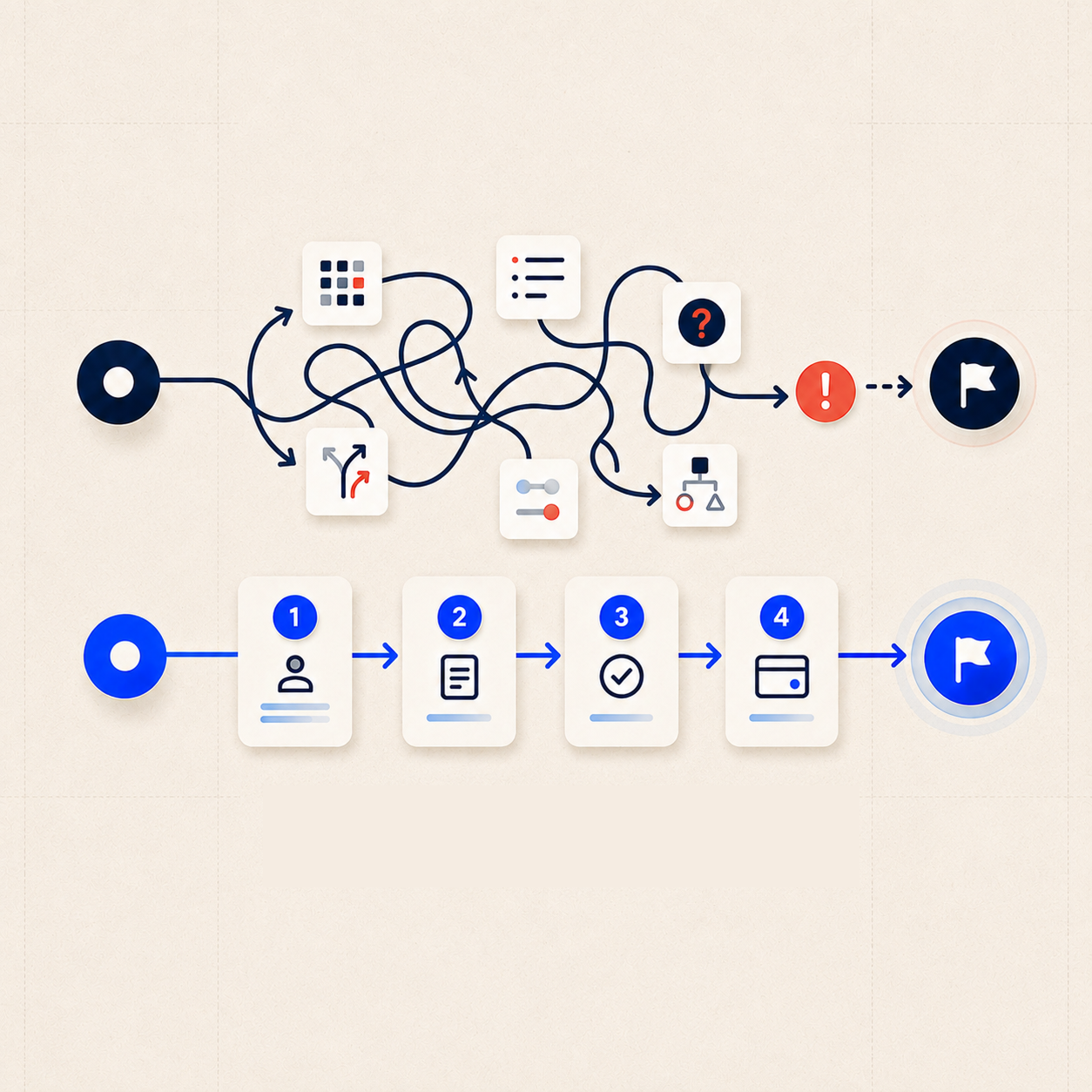
Nielsen’s Heuristics Are Not a Checklist
Problems facing companies or digital products and available solutions.

Let's talk about your project!